If your website was a dating profile, would anyone swipe right?

A friend once told me:
“You’d be great at creating dating profiles. You’re really good at reading people and spotting that one thing that makes them stand out. People like me — always working or back in the dating scene after years — wouldn’t even know where to start.”
I was living in Tulum at the time, building my online business from cute cafés and Airbnbs, when he came to visit for the holidays.

I had just started learning visual and web design, mostly because I loved the idea of helping people translate their vision and ideas into something real.
So I told him:
‘That’s literally why I got into this. Visual design is basically a dating profile but with more fonts.’
Whether I’m designing your website, your visual identity, or helping you figure out what the hell you’re even trying to say, it all starts with the same question: Who are you, really?
Both require you to articulate who you are, what you value, and what you want to attract without pretending to be someone you’re not.
Both fall apart the moment there’s a mismatch between what you say you are and how you actually show up.
I’ve seen this happen with some of my clients (and I’ve been there myself).
“We want to feel approachable…”
…but they communicate like a corporate disclaimer: warm brand dreams but cold, legal tone and AI captions.
It’s the dating equivalent of saying “I’m super easygoing” and making it really hard to book an appointment.
“We want a premium brand…”
…but every decision is made from scarcity: mismatched stock photos, rushed and messy timelines.
Is like having champagne taste with instant-noodles budget.
Premium isn’t just a font. It’s also an attitude.
“We want calm, mindful energy…”
…but their messaging is inconsistent: One day they’re a wellness sanctuary, the next they’re basically a Black Friday sale.
It’s like writing “I love sunrise hikes” even though your hiking boots haven’t left the closet since 2021.
You’re better off saying you enjoy watching the sunrise through your kitchen window.
It’s less poetic, more honest, and ironically, more attractive—probably giving you higher chances of potential matches swiping right.
People feel the disconnect.
Designers see it immediately.
And your audience will sense it subconsciously.
Which is why branding, just like dating profiles, only works when the identity comes first.
You have to become the thing before you can visually express it.
And yes, that sounds like law-of-attraction woo-woo.
But it really is.
And I’m a sucker for it. So now you know.
The “Law of Attraction” of Visual Identity
The biggest thing most new brand owners and founders misunderstand is this:
A brand doesn’t start with a logo, a color palette, or a website.
It starts with identity.
Not the identity you hope to embody someday…
but the identity you consistently show up as today.
(I could not get my head around this for the longest time.)
Before I started my freelance-entrepreneurial journey, I never struggled to find work in the “real world.”
In job interviews, managers could instantly feel my personality, my work ethic, my energy.
But online I had no idea how to translate me into something visible.
So I learned video editing.
Then design.
And now writing—even though for years I avoided it because I thought I wasn’t born with it and couldn’t “find my voice.” Also, the thought alone of sharing my thoughts feels too vulnerable, but I’m slowly getting over it.
I’m still learning (so stay with me), but the more I share from my actual point of view, the more aligned everything feels.
In LOA terms, you don’t attract what you want.
You attract what you are.
Brands work the same way.
You don’t attract clients based on your wishlist.
You attract clients based on the identity your brand actively communicates: visually, verbally, emotionally.
Here’s what that looks like in practice:
If you want to feel warm and approachable…
Then your design choices need to reflect that warmth:
- Softer color palettes
- Rounded or humanist typefaces
- Conversational microcopy
- Real photos, not stiff corporate stock
- Layouts that feel open, breathable, and human
Your visuals should say “Come sit with us,” not “Read the terms and conditions.”
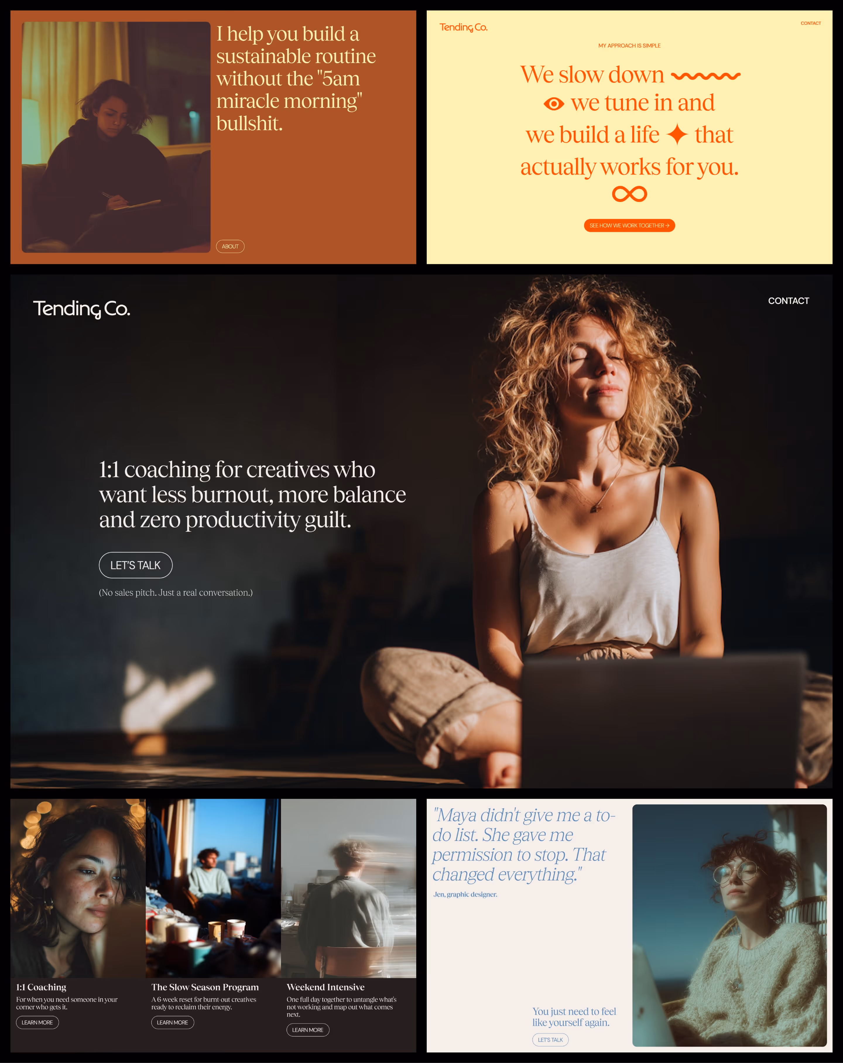
If you want to be positioned as premium…
Your entire presence must feel intentional and elevated:
- High-quality visuals (custom if possible, curated stock if not)
- Restraint in color, layout, and composition
- Elevated typography
- Consistent spacing and thoughtful details
- Clean, confident messaging that doesn’t oversell
Premium brands don’t announce themselves. They exude.
If you want modern, calm, thoughtful energy…
The calm has to exist in your process, not just your moodboard:
- Minimal, spacious layouts
- Slow, intentional pacing in your copy
- Consistent message and tone across platforms
- Visuals that feel grounded
So before choosing:
- A tone of voice
- A visual direction
- A content strategy
- A messaging framework
Ask yourself:
“Who am I, really?”
“What do I stand for?”
“What do I want people to feel when they experience my brand?”
“And am I showing up as that person consistently?”
Because a brand isn’t something you put together in Canva at 2am.
It’s an identity you grow into.
Identity attracts. Design amplifies. Messaging reinforces. And together, they determine who swipes right on your brand, and why.
xoxo,
Aida.